
Page 131 - Demo
P. 131
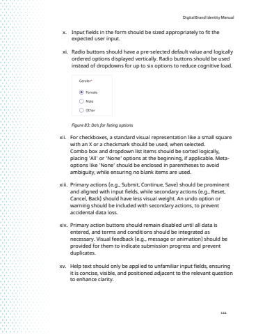
Digital Brand Identity Manual111x. Input fields in the form should be sized appropriately to fit the expected user input.xi. Radio buttons should have a pre-selected default value and logically ordered options displayed vertically. Radio buttons should be used instead of dropdowns for up to six options to reduce cognitive load.Figure 83: Do%u2019s for listing options xii. For checkboxes, a standard visual representation like a small square with an X or a checkmark should be used, when selected.Combo box and dropdown list items should be sorted logically, placing 'All' or 'None' options at the beginning, if applicable. Metaoptions like 'None%u2018 should be enclosed in parentheses to avoid ambiguity, while ensuring no blank items are used.xiii. Primary actions (e.g., Submit, Continue, Save) should be prominent and aligned with input fields, while secondary actions (e.g., Reset, Cancel, Back) should have less visual weight. An undo option or warning should be included with secondary actions, to prevent accidental data loss. xiv. Primary action buttons should remain disabled until all data is entered, and terms and conditions should be integrated as necessary. Visual feedback (e.g., message or animation) should be provided for them to indicate submission progress and prevent duplicates.xv. Help text should only be applied to unfamiliar input fields, ensuring it is concise, visible, and positioned adjacent to the relevant question to enhance clarity.
