
Page 44 - Demo
P. 44
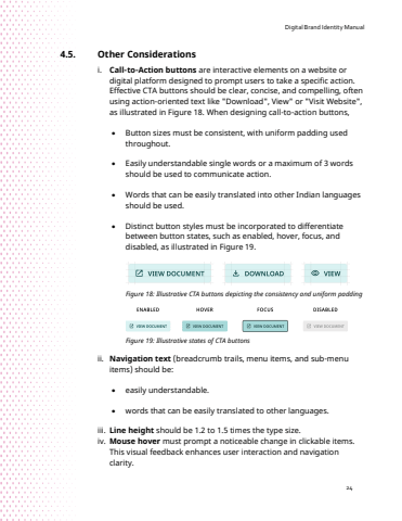
Digital Brand Identity Manual244.5. Other Considerations i. Call-to-Action buttons are interactive elements on a website or digital platform designed to prompt users to take a specific action. Effective CTA buttons should be clear, concise, and compelling, often using action-oriented text like \as illustrated in Figure 18. When designing call-to-action buttons, %u2022 Button sizes must be consistent, with uniform padding used throughout.%u2022 Easily understandable single words or a maximum of 3 words should be used to communicate action. %u2022 Words that can be easily translated into other Indian languages should be used.%u2022 Distinct button styles must be incorporated to differentiate between button states, such as enabled, hover, focus, and disabled, as illustrated in Figure 19.Figure 18: Illustrative CTA buttons depicting the consistency and uniform padding Figure 19: Illustrative states of CTA buttons ii. Navigation text (breadcrumb trails, menu items, and sub-menu items) should be:%u2022 easily understandable.%u2022 words that can be easily translated to other languages.iii. Line height should be 1.2 to 1.5 times the type size.iv. Mouse hover must prompt a noticeable change in clickable items. This visual feedback enhances user interaction and navigation clarity.
