
Page 39 - Demo
P. 39
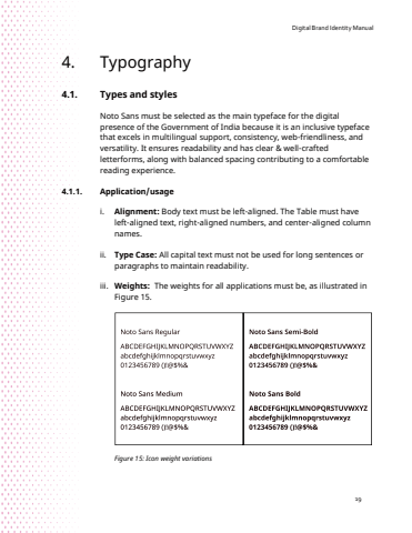
Digital Brand Identity Manual194. Typography4.1. Types and stylesNoto Sans must be selected as the main typeface for the digital presence of the Government of India because it is an inclusive typeface that excels in multilingual support, consistency, web-friendliness, and versatility. It ensures readability and has clear & well-crafted letterforms, along with balanced spacing contributing to a comfortable reading experience. 4.1.1. Application/usage i. Alignment: Body text must be left-aligned. The Table must have left-aligned text, right-aligned numbers, and center-aligned column names.ii. Type Case: All capital text must not be used for long sentences or paragraphs to maintain readability.iii. Weights: The weights for all applications must be, as illustrated in Figure 15. Figure 15: Icon weight variations
